Wayfarer
Mobile app design for travelers

Project Overview
About Wayfarer: A destination website aimed at young people, ages 21-30, who travel frequently and are in search of new adventures worldwide.
Brief: Design + prototype 3 minimal and user-friendly screens. An index page (desktop and mobile), search tool (mobile), and destination page (mobile).
Timeline: 2 weeks
The goal: Design an informative, easy-to-use, and visually appealing mobile app for travelers.
Role: Competitive Analysis / UX + UI Design / Wireframing / Prototyping / Brand Identity / Icon Design
Empathize + Define
Questions
Asking these questions to myself was important before beginning to ideate.
- What are the traveler’s motivations and pain points when planning or discovering trips?
- What influences a traveler to choose a landmark?
- How can the design visually enhance the user’s experience while browsing for destinations?
- What is the best way to structure the site so the user isn’t overwhelmed?
- What features would be useful or expected when searching for travel destinations?
Competitive Analysis
To better answer my questions, I wanted to understand what kind of tone destination sites use, what kind of features would be useful for a traveler, and how information is structured.
Fathom

Tone: Minimalist design and copy.
-
Simplicity
-
Neutral colors were calming
-
In-depth experiences of destinations
-
Unable to save destinations or read reviews
-
Weak search tool
-
No hierarchy in destination pages
-
Too much story-telling, not enough useful resources and tools that help a traveler
Atlas Obscura

Tone: Earthy and outdoorsy.
-
Many ways to discover destinations (ie blogs, featured/popular, tags, or search tool)
-
Strong search tool with recommendations
-
Destinations have a good balance of storytelling and information
-
Unusual visual hierarchy on destination page
-
Information is useful but overwhelming
Solution proposals
- Generate various ways you can discover destinations: strengthen the search tool, categorize destinations based on popularity, featured, top cities, or blogs/storytelling.
- Keep the UI minimal: Provide useful at-a-glance info, but allow the user to expand more detailed info, when needed.
- Curate experiences: Allow users to create accounts to receive relevant recommendations, keep track of visited/favorite destinations, and leave reviews.
Ideation
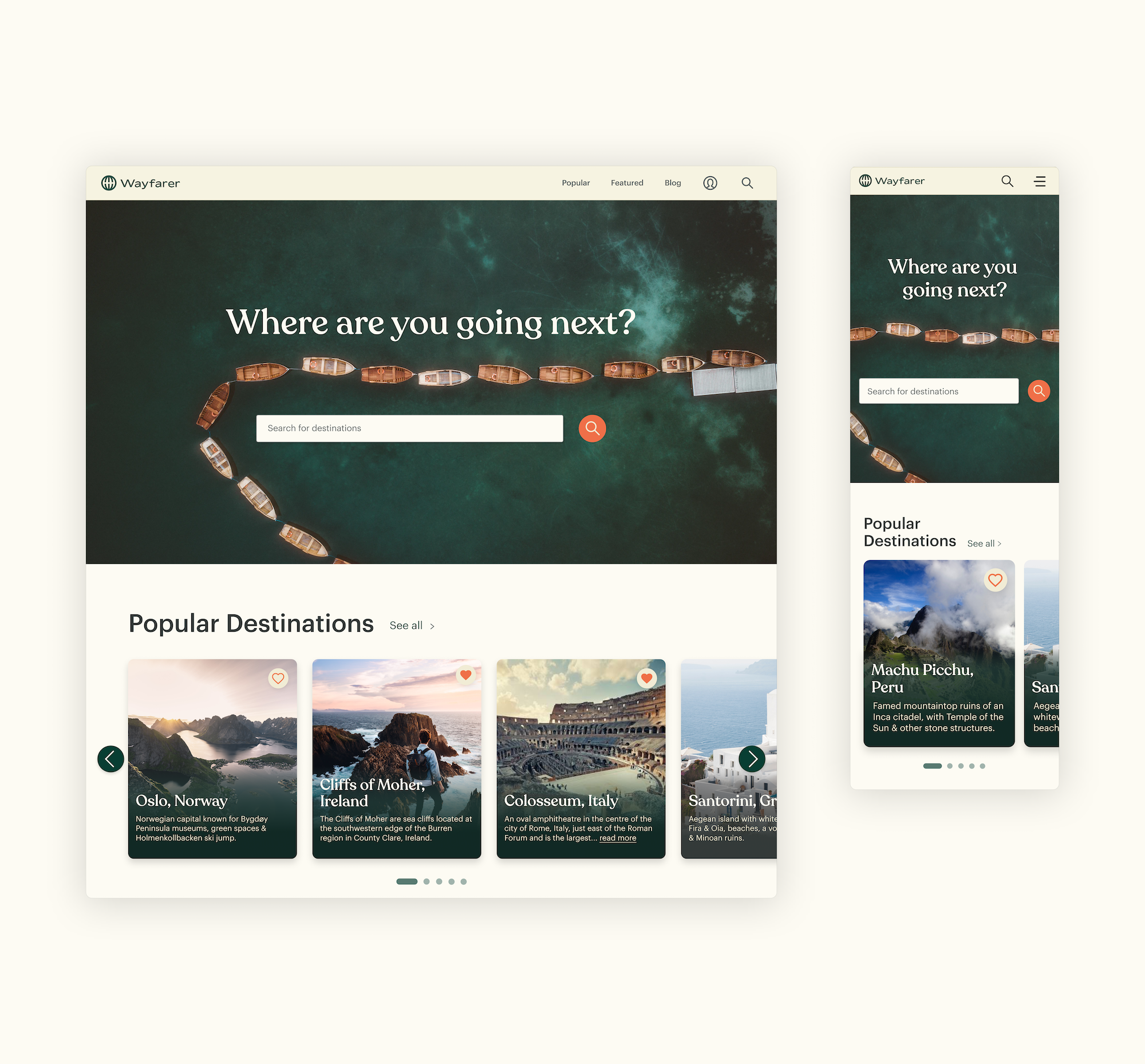
Home page (Desktop) Wireframes

Search tool (Mobile) Wireframes
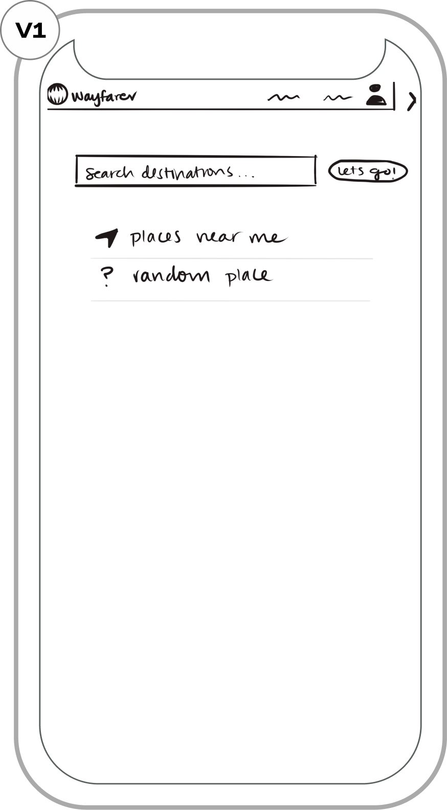
How can we create multiple avenues for searching destinations?

Experimentation with the visual hierarchy. I wasn’t a fan of the 3-column system.

Images felt small on mobile. On the final prototype, I found a middle ground between this frame and the last one.
Destination Page (Mobile) Wireframes

Experimenting with the side nav bar. I realized this wasn’t a good use of space.

Experimentation with segmented control in the nav bar. Hiding detailed info ensures the user isn’t overwhelmed.
Prototype & Testing
Header & Body - Type Selection

Color Palette Selection
The palette colors are borrowed from the outdoors. This is very applicable for the brand and the subtle pop of colors are very youthful and energizing.

Icons
Logo - Type Selection & Kerning
For the logo font selection, I had two criterias:
1. The font must differentiate itself from the body and header fonts
2. The type must be youthful, adventurous, and effortlessly blend with the logo symbol.
After I made my decision, I applied letter kerning.
Destination Card - Type Selection

-
Clean and modern
-
Targeting a different kind of audience
-
Our audience is young and this type doesn’t feel adventurous

-
Sleek, minimal, and easy-to-read
-
Curvyness of the type is very fun
-
Sans-serif font feels too similar to the description

-
Pairs well with the sans-serif description
-
Serif font evokes history, but is not too serious
Destination Card - Accessibility

The first version was not WCAG compliant
- Poor contrast with the heart button
- Poor readability with body of text
- Design is not versatile for images

On the second version, accessibility & readability were prioritized
- Better contrast with the heart button
- Improved readability with darker gradient
- Any image can work with this design
Blog - Structure

The structure felt somewhat unbalanced and the title of each blog article did not stand out.

A few things changed:
- Removed the underline in “See all” since the arrow already provided affordance.
- Shortened the text block width for better readability.
- Ran a contrast check, and darkened the title & description.
- Increased padding because all the blog posts had high proximity.
Search Tool (Default State)

Initially, these two buttons were available to give the user an option to explore.

Recommending specific destinations could be more useful when a user is browsing.

Changed the colors on CTA buttons to prioritize “Places near me”. Search box’s background color is true white for more contrast.
Search Tool (Active State)

As the user types in a search query, recommendations start to update on the fly.
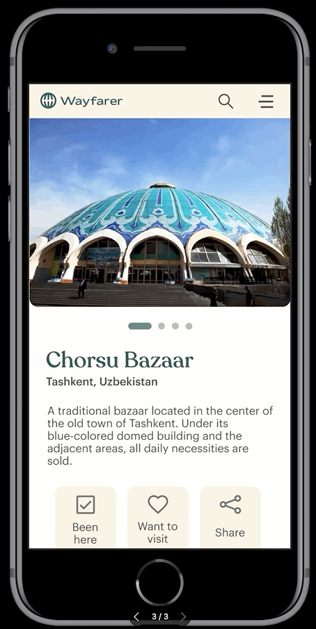
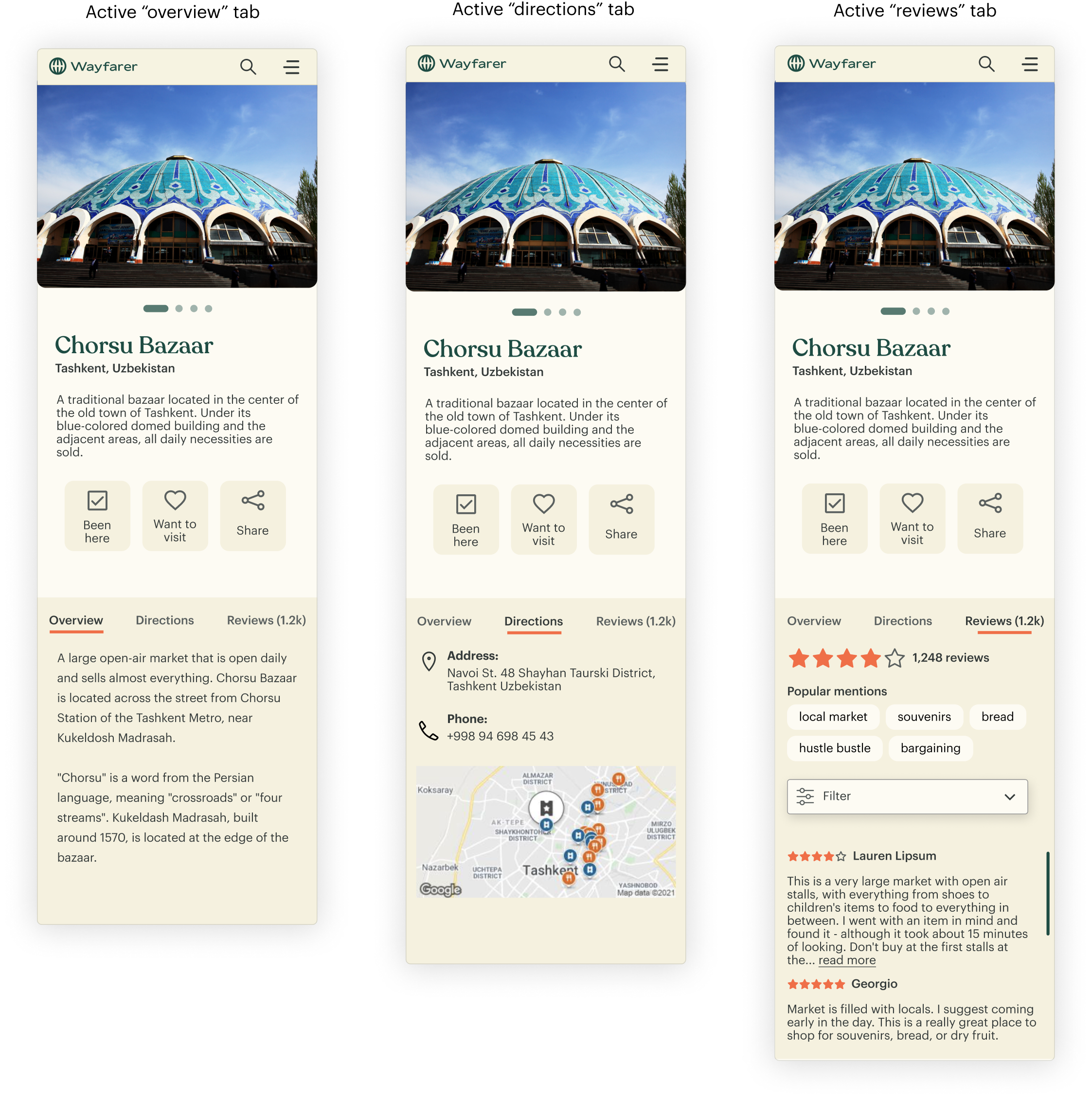
Destination Page

Users are able to swipe through photos, read a brief description, take action with the buttons, or continue to scroll for more info.
Destination Page - Segmented Control

Overview gives a more thorough background and history on a destination.

Directions has an address and map, and contact numbers if applicable.

The reviews feature popular keywords mentioned by other travelers and an option to filter reviews.
Destination Page - Interactions
High Fidelity Mockup
Home screen
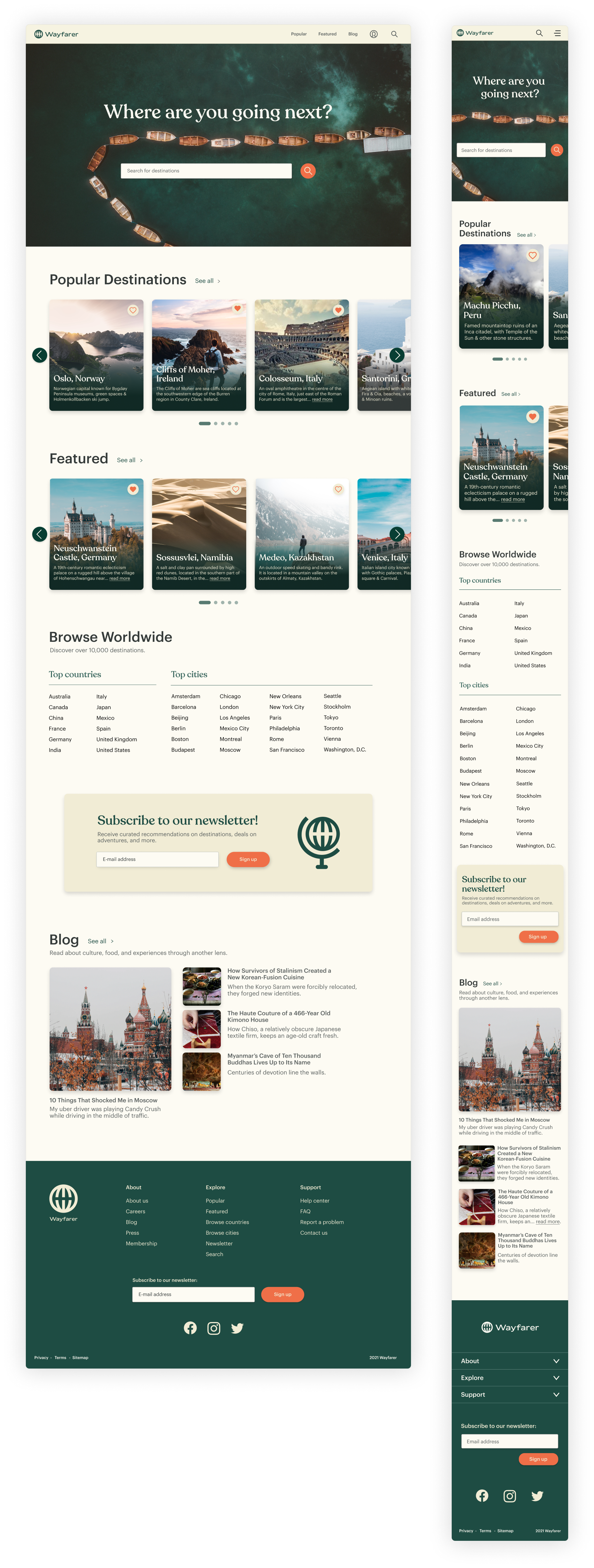
Search screen

Destination page
Key Learnings
- Improving readability: Searching for destinations is information-heavy. Visual hierarchy, color contrast, and segmented control helps organize dense information and maintains simplicity for users who are browsing.
- A bit of research goes a long way: I wish I had more bandwidth to research thoroughly; however, working within a time constraint, I learned that even a bit of research went far. Running a competitive analysis provided insight when it came to prioritizing features and branding/styling decisions.
 Back to all projects