Spotify
Designing an engaging profile experience
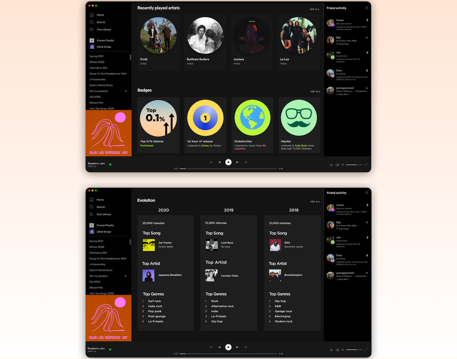
Project Overview
About Spotify
A music streaming platform, used mostly by gen-z and millenials. Well-known for their music recommendation algorithms, annual Spotify Wrapped campaigns, and social aspect.
Brief
Research, design, prototype, and test ways to answer the question “How can we utilize existing strengths to increase engagement in Spotify?”
The goal
Design a new, more engaging way for people to interact with their Spotify profiles.
My role
User Research / UX + UI Design / Usability Testing / Empathy Mapping / Wireframing / Prototyping / Brand Identity / Icon Design
Empathize
Understand
According to stats from Forbes:
83%
of consumers are willing to share their data to create a more a personalized experience.
86%
of marketers have seen a measurable lift in business results from their personalization campaigns.
90%
of U.S. consumers find product personalization very or somewhat appealing.
The company is best known for their machine learning and AI-driven personalized experiences. We can use this strength in an area of Spotify that lacks engagement and personalization in order to stay competitve.
“Companies are competing with every other experience a customer has. This presents an opportunity for forward-thinking brands to create positive experiences that customers want to talk about to others”
— Dan Gingiss, author & customer experience expert
Problem Assumptions
- Listeners enjoy learning about their friend’s music habits, but there are few features that help you gain insight
- Profiles do not satisfy curiosity and provide enough joy, therefore, users don’t have incentives to visit profiles
- Profiles do not tell stories about the listener
Survey
To test if my problem assumptions were correct, I created a survey to understand the habits and opinions of our users.
- 60 participants revealed their profile-visiting habits and features they valued most in Spotify
- The criteria: respondents must use Spotify regularly (at least 3 days in a week) and use the desktop app (at least once a week)
Strengths: music algorithm and annual Spotify Wrapped campaign.
Spotify Wrapped scored high, even though listeners use this feature once a year.
50% of the respondents landed on a friend’s profile by seeing their recently played songs in the Friend Activity list.
Survey Takeaways
- Listeners enjoy gaining insight: Spotify Wrapped is a highly effective campaign because users enjoy receiving reports on their music habits and seeing their friend’s results
- Personalized experiences are a strength: The recommendation algorithm + Spotify Wrapped campaign is a large reason why users favor Spotify over other competitors
- There’s room for improvement in user profiles: My hypothesis was supported. 78% of the respondents visit profiles <2x a month — when visiting, they are curious about music habits
- Listeners turn to friends for music suggestions: Despite having access to recommended playlists from Spotify, users turn to the friend activity list when they’re curious or run out of ideas
User Interviews
Using the takeways from the survey, I constructed six interview questions for four people to understand how users think and feel about certain Spotify features. Here are the main takeaways:
Users can’t seem to describe their music tastes.
“That’s an extremely broad question. I don’t know how to answer that.”
Spotify Wrapped is highly anticipated because users enjoy learning about their music habits and sharing them.
“The results define who I was that year. That’s why I share them, and I enjoy seeing what others get.”
Users rarely visit profiles because they don’t offer anything interesting.
“There isn’t anything interesting to see. It’s mostly just recently played artists.”
Define
Empathy Mapping
The purpose of this was to summarize my research findings and gain a deeper insight into the average Spotify listener.
Problem Statement
Spotify listeners need an engaging way to browse profiles because they enjoy gaining insight into both their own music habits, as well as their friends’.
Solution Proposals
- Provide users with more profile customization features
- Create unique and engaging profile features that allows users to track their listening history
- Create a badge system that engages listeners and informs them about their own music habits, as well as their friends'.
Ideate
Design Guidelines
Referring to Spotify’s design guidelines helped define component & UI styling before ideating or prototyping.
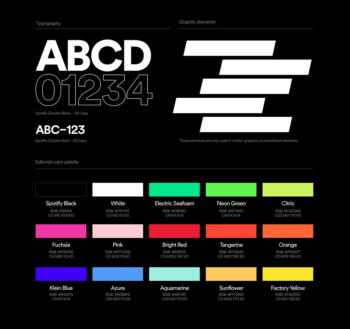
Examples of considered design guidelines:
- Limited character count for album, artists, and track names
- Dedicate the full row (shelf) in the view to Spotify content
- Never show more than 20 items in a content set
- Never overlay images or text on top of album artwork
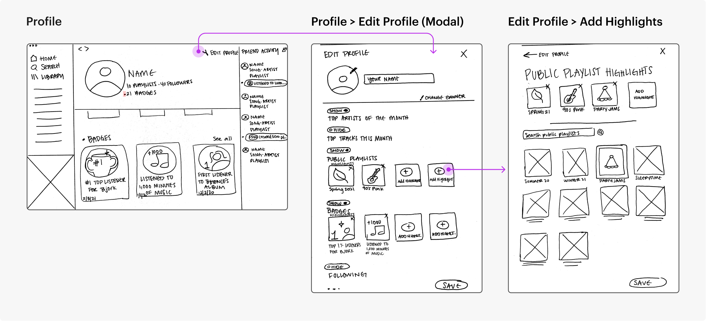
Wireframes

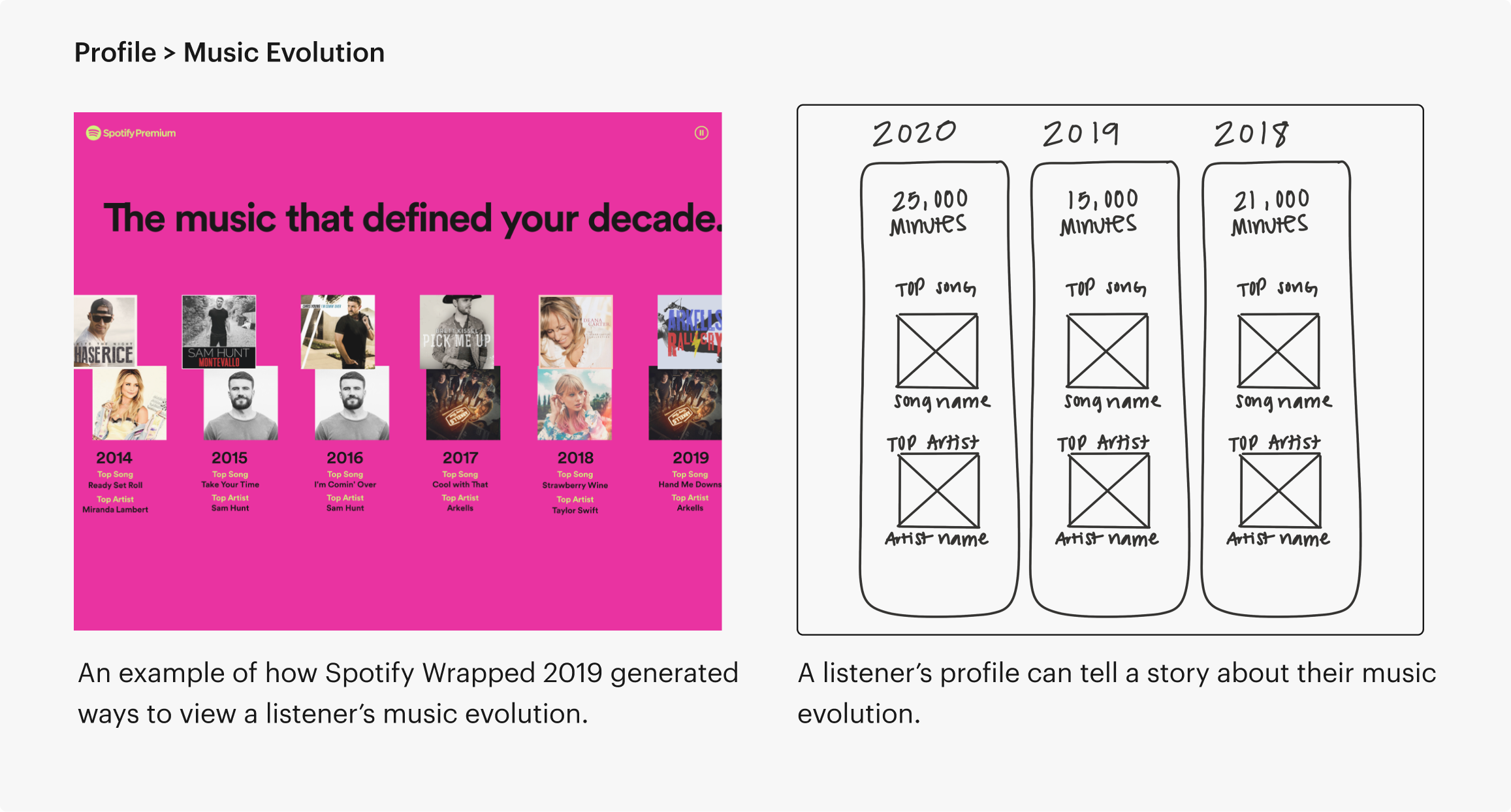
User Testing
I tested my wireframes on 3 individuals, which was recorded for later reference. They were given a series of task scenarios.
-
Positive responses to the new profile features
-
Functions of each profile feature was predicted correctly
-
People were focused on the accomplishment itself, not the user who earned it

Badge Testing
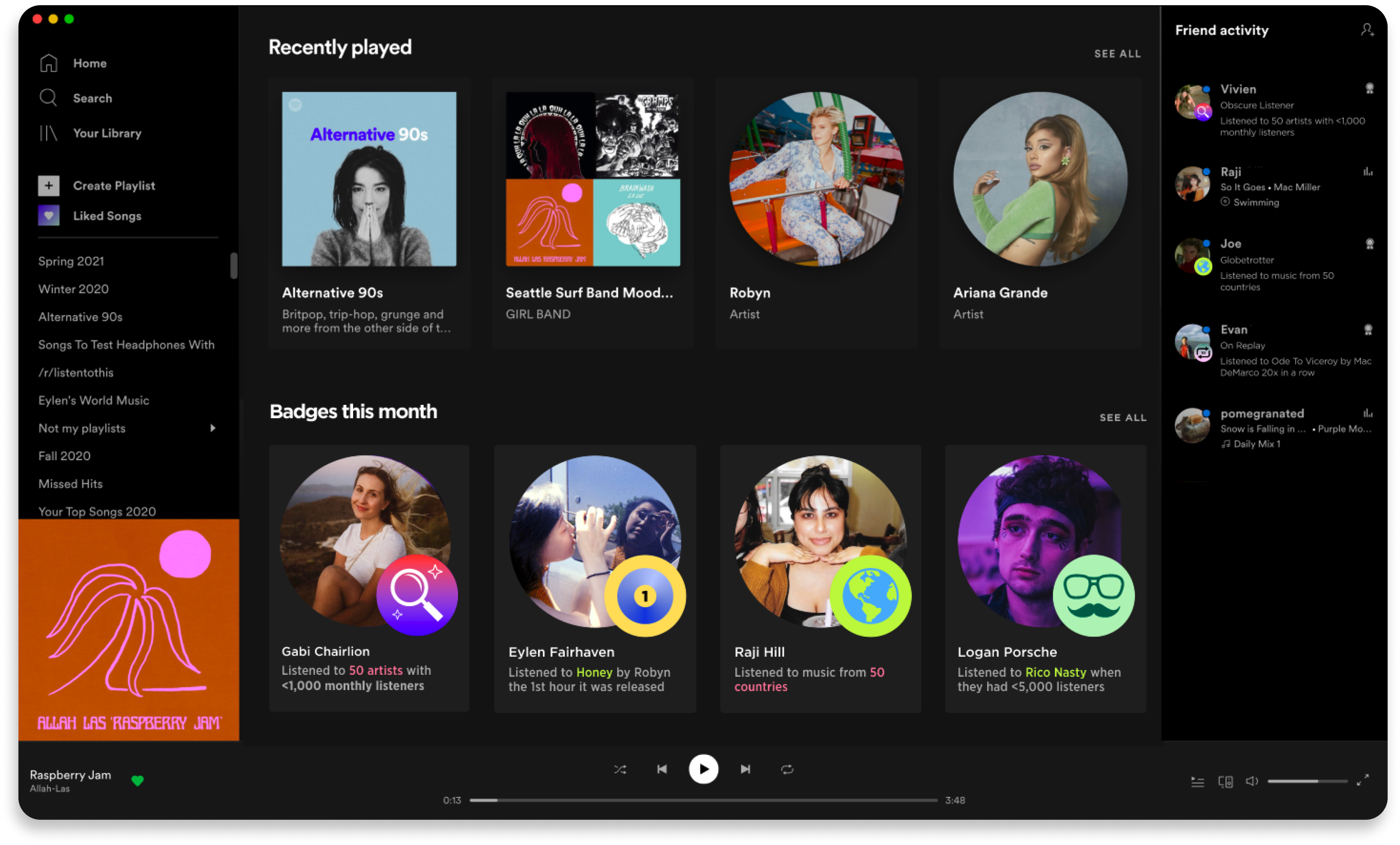
Creating a badge system will supplement the Spotify Wrapped campaign by allowing users to share milestones in their profiles. Throughout the year, users can also obtain rare badges that falls outside of the Spotify Wrapped scope.
I sketched a few ideas on what kind of badge a listener can earn, keeping Spotify's color choices in mind as well:

Prototype + Test
Badges
Prototype
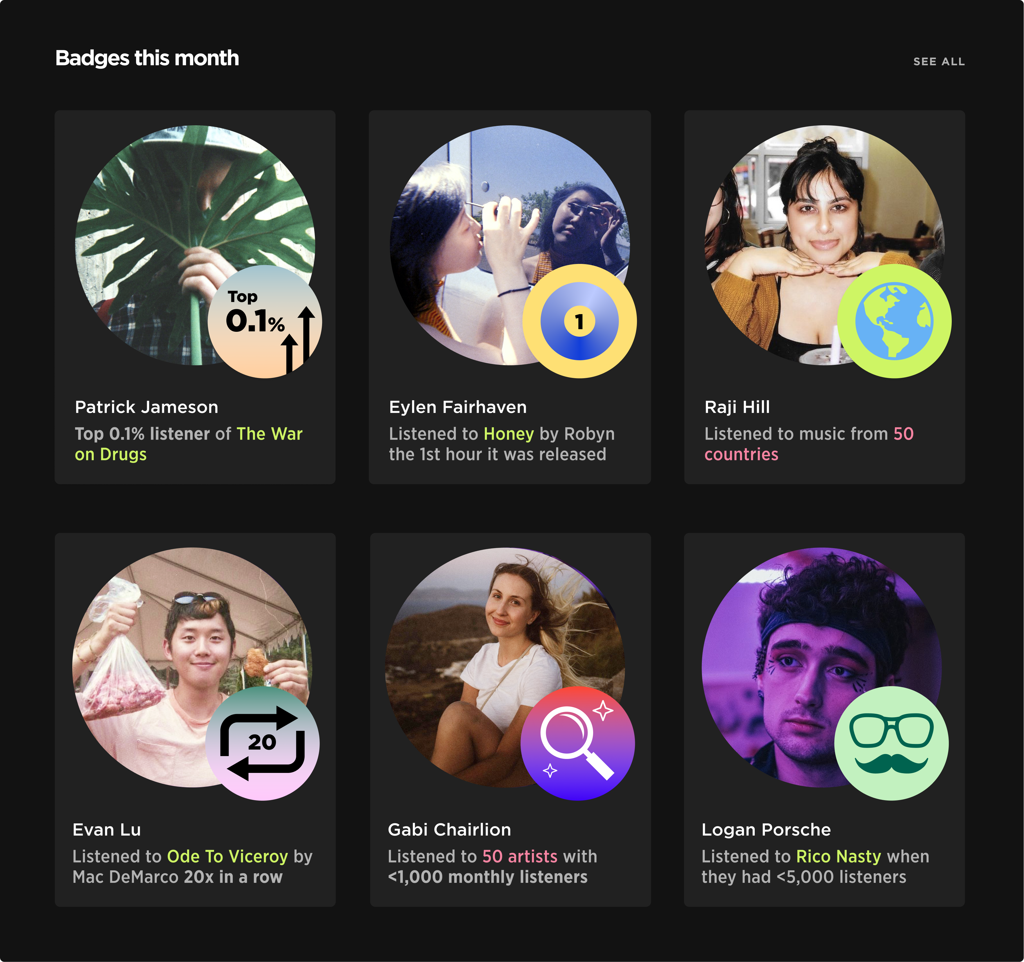
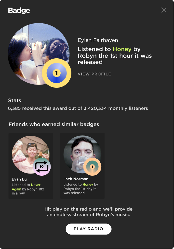
When clicking on a badge, a modal window pops up with more information.
You can visit the badge-earner's profile, read stats, view friends who earned similar badges, and listen to recommended playlists by Spotify.
Friend Activity List
Current experience
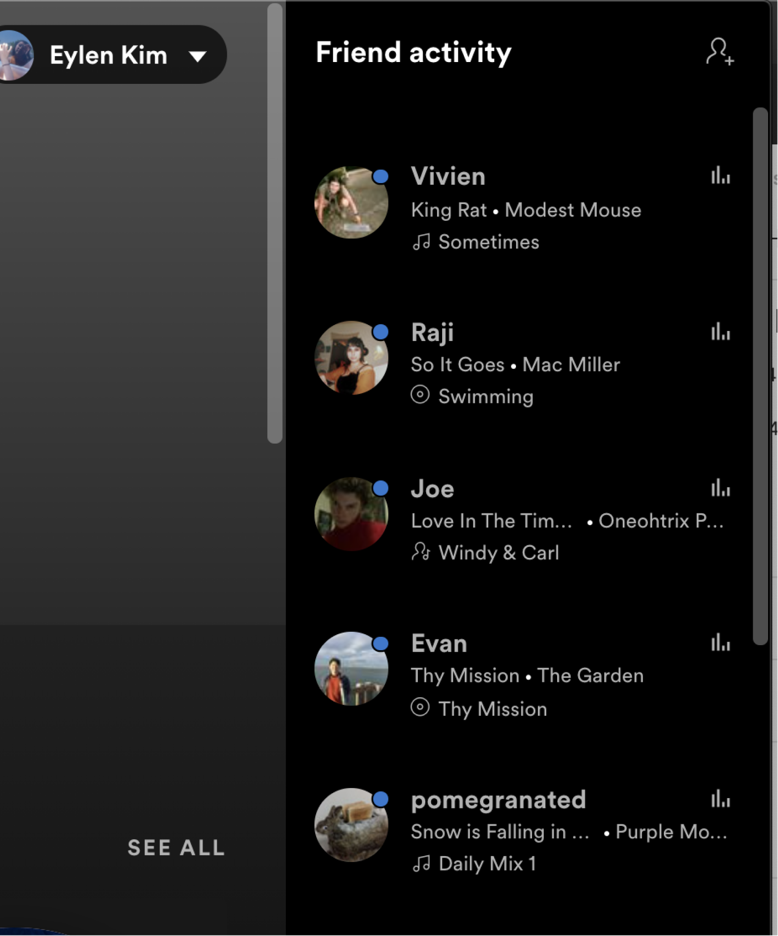
This is what the friend activity currently looks like on Spotify’s desktop app.
Tucked on the right-hand side, it displays songs your friends are listening to.
Prototype & testing
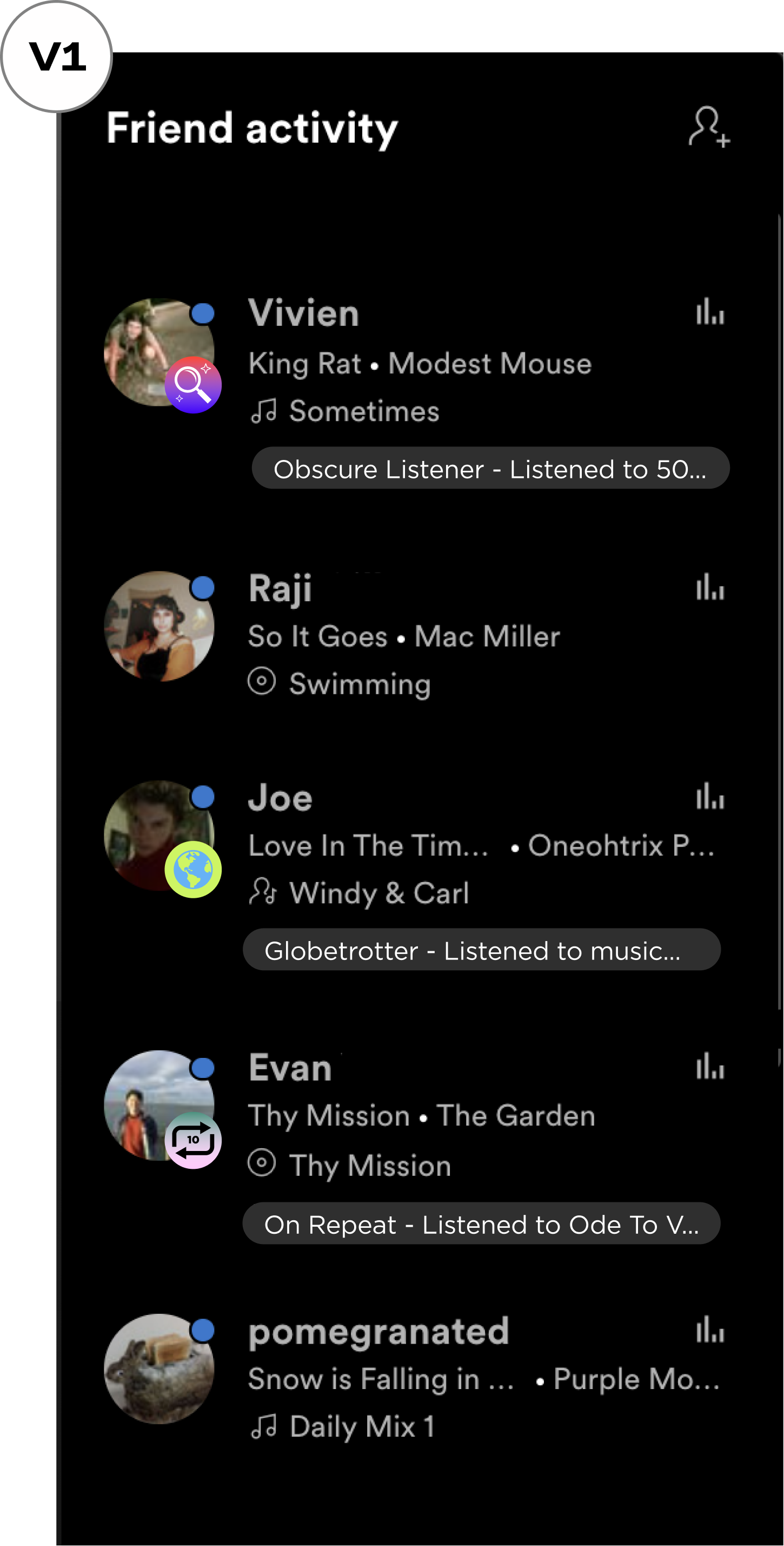
-
Badges + recently played songs are tied to one user
-
Badges could be confused with recently played songs
-
Badge names cut off too soon before revealing interesting information
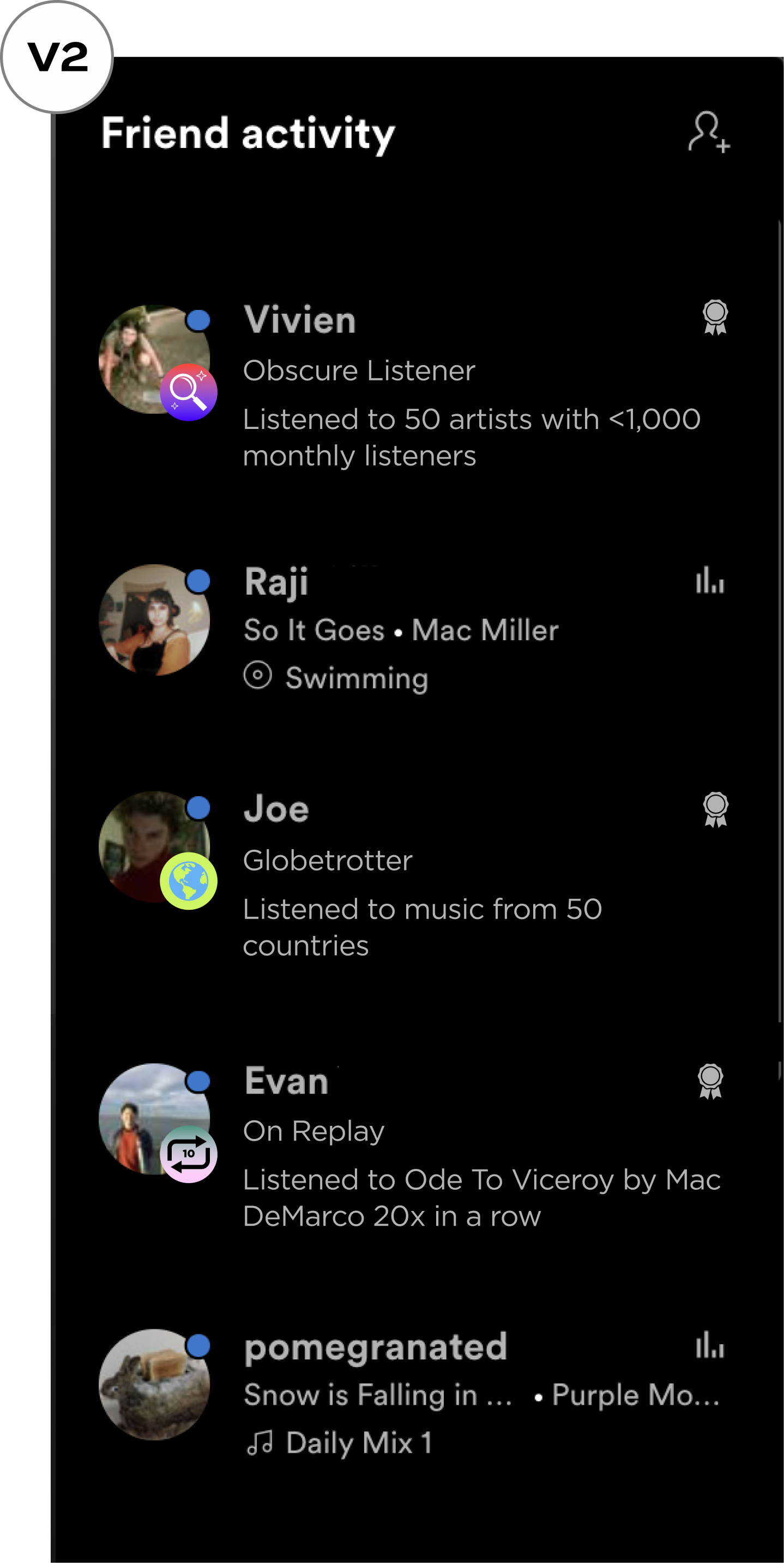
-
No more confusion — recently played songs and badges have their own slot
-
Users notice badges easily = more curiosity
Evolution
Prototype & testing
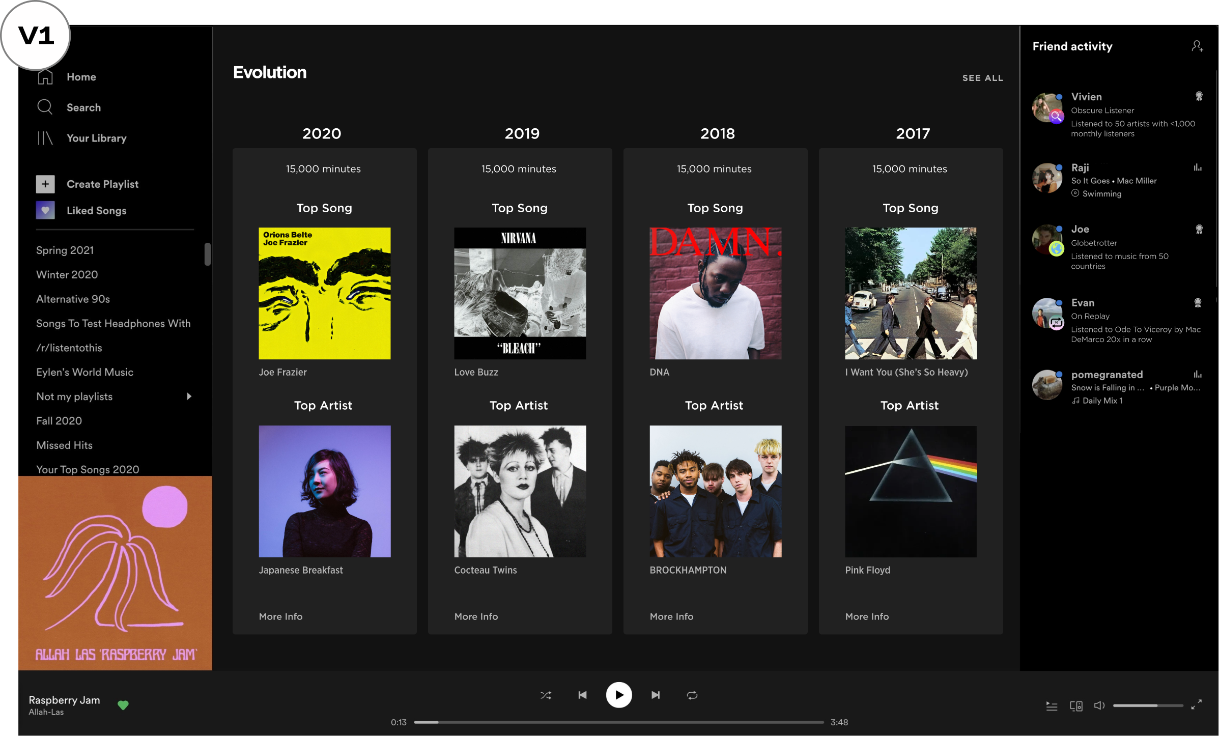
-
Minimal, visual, and easy to digest
-
Not enough insight into a user’s history
-
“More info” button takes the user away from the page
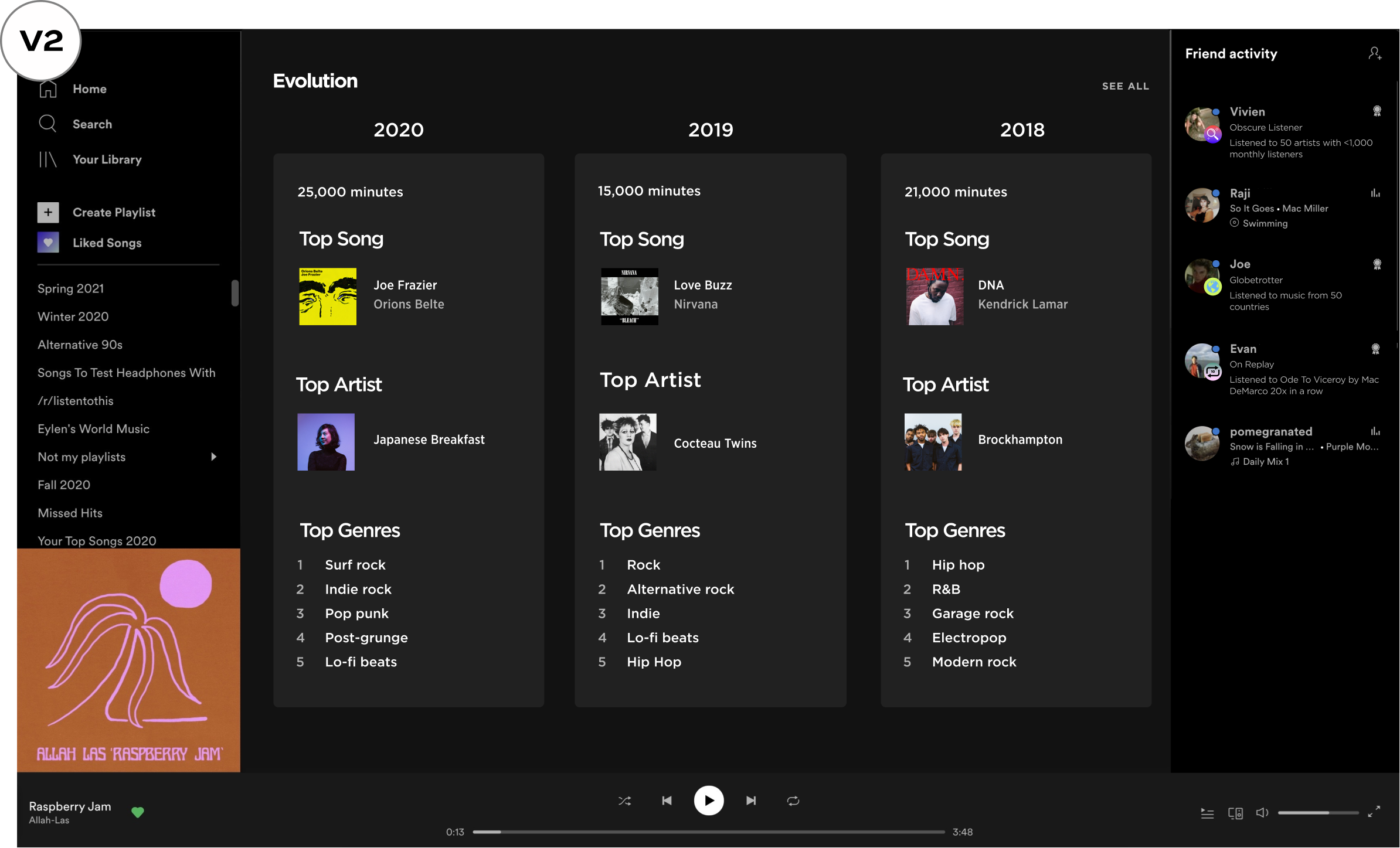
-
Minimal and informational
-
“Top genres” is an important aspect of a user’s history
-
Less scrolling and more info
Profile Customization
Current experience
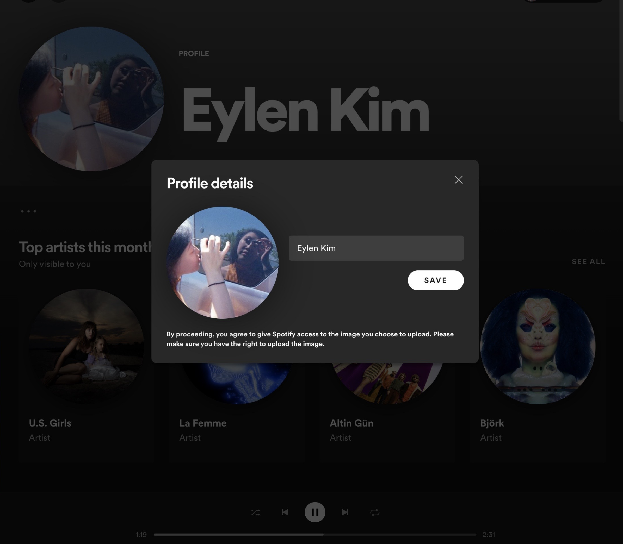
Currently, Spotify allows you to customize your profile in two ways. You can change your profile picture and display name.
Prototype
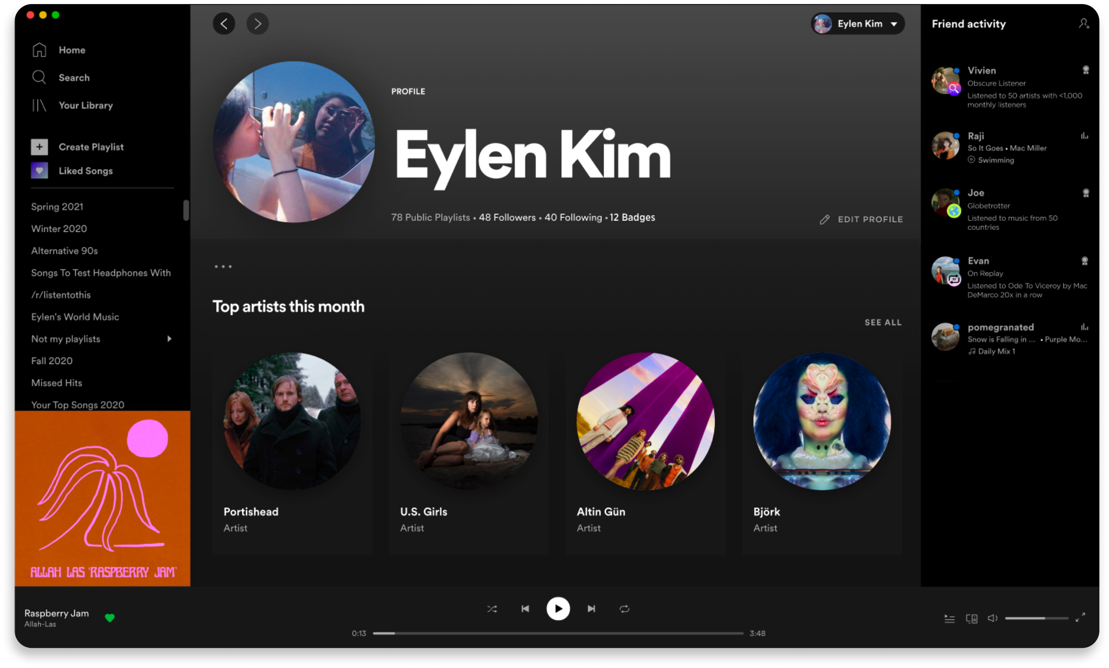
In this prototype, users have control over what they want to display in their profile. They can also choose to highlight badges or playlists they are most proud of.
When choosing to highlight badges, users have control over the display row of badges in their profile.
High Fidelity Mockup
Profile


View badge

Edit profile

Home page
Key Learnings
- Centering human empathy allows us to achieve business outcomes: After re-phrasing the business issue to a more user-centered approach (in Problem Statement section), it was easier to empathize, research, and achieve higher engagement.
- Always think about feasibility: Understanding the project complexity allowed me to determine the project was feasible because it reused code and data analytics from Spotify Wrapped.
- A project rarely starts with you — understand its past: By acknowledging the success of Spotify Wrapped and their music recommendation algorithm, I can ask effective questions during research and confidently develop new user experiences + features.